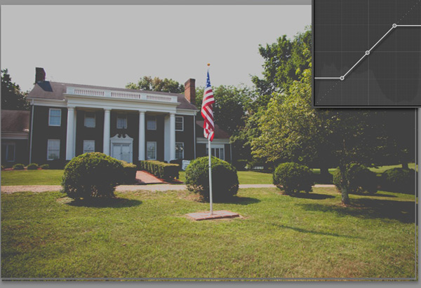
One of the most popular editing effects right now is pushing digital images to look more like film photos. Digital has taken over the world, but film has a “look” that’s just hard to match. I would certainly advocate going out and shooting some rolls of film, but if that’s not a possibility, we can use Lightroom to apply a vintage film effect using the tone curve.
The tone curve scares some users away because it’s not like anything that they’ve ever seen before. It’s a graphical representation of the photo, and it’s not necessarily logical. Let’s take a look at how to use it.
- First of all, go ahead and pick an image to work with and enter the Develop module.
- Now, feel free to apply any other tweaks that you need to – exposure, clarity, temperature, etc.
- Okay, scroll down the right panel in the Develop module and you’ll come to the Tone Curve. This has the secret sauce for what we want to do.
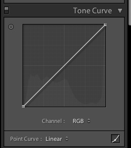
Here’s what my tone curve looks like to begin with:
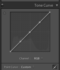
Looking pretty flat right now right? What we want to do is add some control points that we can shape this curve with. To add these points, all we have to do is click where we want the points. I added three points; this is how I positioned my points:
Okay, now we’re ready to have fun. Let’s talk a little theory here. Right now, we’re starting with a default tone curve. The point at the lower left hand corner represents the black areas of the photo. The point in the upper right hand corner represents the “whites” of the photo. As we move these points, we’re pushing the blacks to grey, and likewise for the whites. You’ll see what I mean here in a moment.
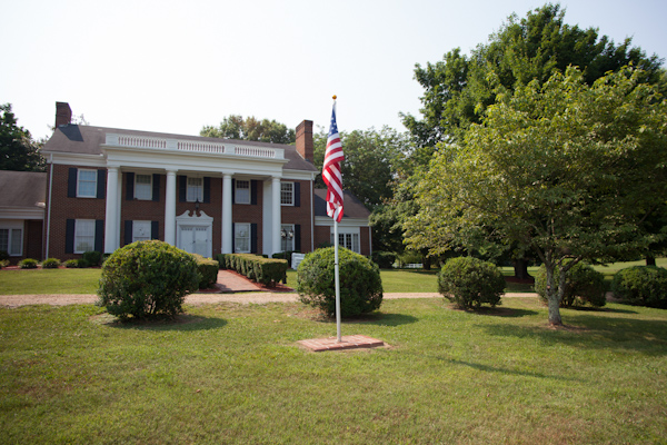
So here’s my starting image:
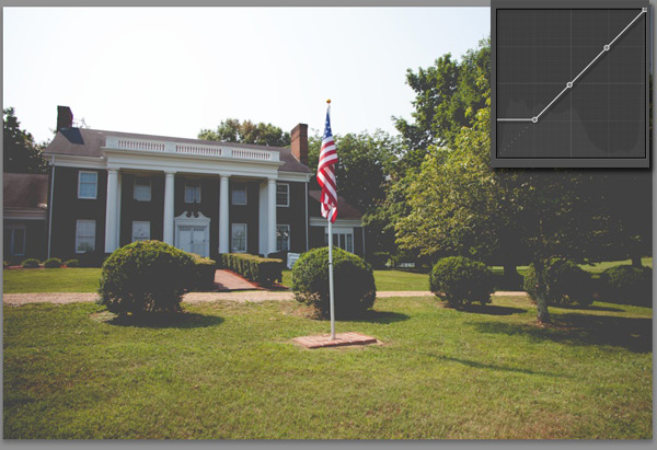
Now, to start playing with the image, I’m going to grab the lower left hand corner point, and start dragging it up. I pull it up until it flattens out.
See what happened here? In the upper right corner, you can see how my curves look at this point. Compare this to the earlier image, and you can see that the black areas of the photo are pushed to greys. That’s what playing with the tone curve does!
Now, let’s play with the upper right hand corner. Here’s what we get:
Now, we’ve pushed the white area – represented by the upper right hand point, down to the greys as well by dragging it downward.
I really like the effect that this provides. It kind of “mutes” the photo and reduces the contrast, and reminds of the film photos that I grew up around.
Of course this can be done with a free lightroom preset as well.
