Let’s get creative with our editing today! With Lightroom’s split toning panel, we can use some color effects to
You’ll find the Split Toning Panel in Lightroom’s Develop Module. Today, we’ll be using a portrait provided by my friend Forrest Lane to experiment with.
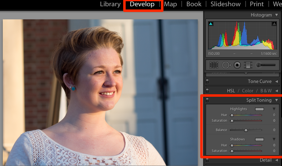
The split tone panel can be found in the Develop module on the right side.
What the split tone panel allows us to do to add and control color to highlights and shadows of our images. We can tightly control the way that those areas appear. The highlights are of course the bright areas of the photo, while the shadows are the darker areas of the image. (Seems basic, but just want to be clear here. :D)
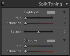
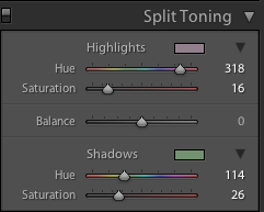
The split toning panel has three sections: highlights, balance and shadows. For the highlights and shadows areas, there are two sliders each: hue and saturation. Hue controls the color we want to add, and saturation controls how much of it we want to add.
Let’s get started with making some adjustments. The first part that I always adjust is the highlights. You’ll notice on the panel that for the highlights, there are two sliders: hue and saturation. Those two sliders have different functions:
- Hue controls the color to add
- Saturation controls how much of it we want
For my example, I’m going to slide the hue slider for the Highlights over to the red/pink area. You’ll notice that that slider is actually color coordinated and you pick your hue color by sliding it to the appropriate color. I’m also sliding the saturation up just a bit for a subtle color effect. Just a note, you can also click the little box to the right of “Hue” to precisely choose a color.
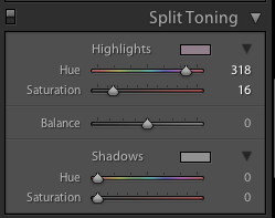
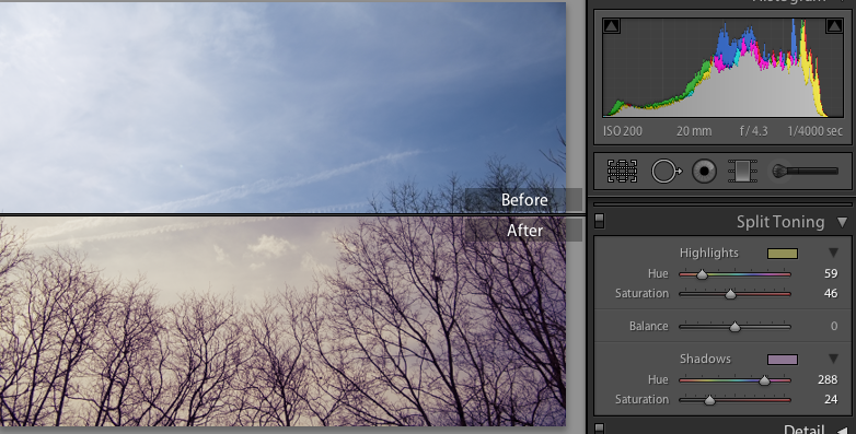
I’ve slide my hue slider to a reddish / pink area and have moved the saturation up just a bit for a somewhat subtle effect.
Here’s what the image looks like after applying these sliders:
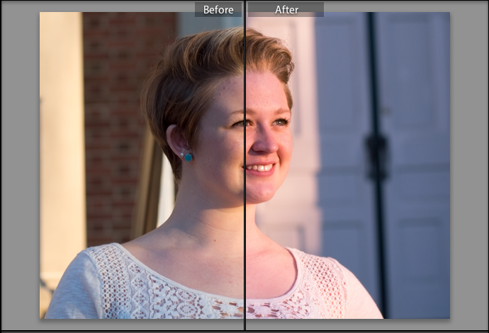
On the right, you’ll see the impact on the image. The highlight areas of the image are subtly toned to be reddish in tint.
Great! Now let’s make an adjustment for the shadows, this time picking a different color.
This time, I’ve tweaked the shadows, pushing the hue into greens and the saturation at about the same level.
And here’s the outcome:
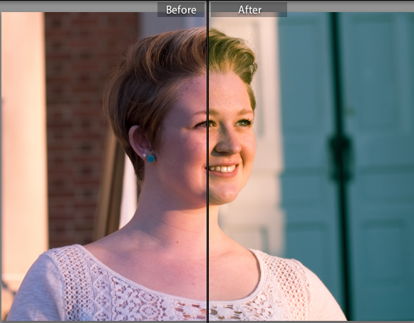
On the right, you’ll see how the shadows adjustment impacted our image.
I love split toning because it opens the game up completely to creative color effects. This is also a great opportunity to throw in some presets and save your split tone effects for later.
There’s one more slider to experiment with; the balance slider can help us show more or less of our highlight or shadow toning ; plus balance will lead us to make the highlight tones more obvious and a minus balance will make our shadow tones more present in the photo. It can be adjusted to taste, and I always recommend adjusting “Balance” last after dialing in your other settings.
In the comments, feel free to share links to your split toned images. Or, if you need more help, I’ll be glad to share some more tips.
One thing I would encourage you to think of is to think in terms of complementary colors or interesting color schemes. Here are some “image recipes” for how I created some interesting split toning effects:
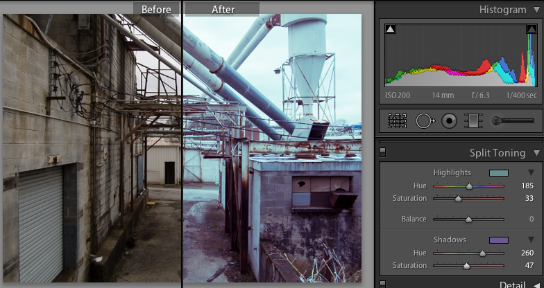
Industrial Scene
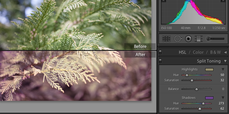
Foliage
Skyscape