Lightroom Love

  • Home
  • Presets
  • Get Help
  • Contact

Make Lightroom Work For You!

March 2, 2019 by Andrew Leave a Comment

A reader recently wrote into me with the following message:

I love the blog. I’m learning so much about how to use Lightroom. I can follow all of the guides, but my photo life is still a mess. I know how to do things, but not how to use them on my own images.

The truth is that I can only dole out so much advice. As you’ll often see me write in my posts, I will give you advice based on how my workflow works. There’s a problem with that though.

I don’t shoot like you. I shoot different things, with different cameras and onto different computer systems. If you try to copy me, it won’t work as well for you. It’s not because my workflow is great (it’s certainly not), it’s because the core worth of the workflow is that it meets our needs as a shooter.

I can only do so much to provide help. I used to be like you – I would follow tutorials and guides to a “T”. And yet, it didn’t help me to solve my problems or increase my creative work. The issue is that I was so busy trying to imitate others, that I didn’t innovate on my own work.

The issue is that I was so busy trying to imitate others, that I didn’t innovate in my own work.

I hope you will explore the site and take a look at the advice I offer, as well as the way that I recommend doing things. But you’re going to have to work with your own images to get the hang of how to apply all of your knowledge. Make Lightroom work for you.

I won’t ever claim that anything I do is the best way to do something. I create solutions to my own issues. My posts, I think, are a good mix of how to do things and why to do them. If you understand the techniques and steps to take to accomplish things, you might begin to understand how you can apply them to your own image needs.

With all of that said, I’m always available for help. Check in in the comments or shoot me an email on the contact page so we can help you do what you do.
Filed Under: Lightroom Tagged With: finished

Building Keyword Sets in the Library Module

January 20, 2019 by Andrew Leave a Comment


A little while back, we got started with using keywords to add tags to our images. A lot of my readers wrote in to thank me and shared that adding those keywords makes their images a lot more searchable.

However, it wasn’t all good feedback. You see, although keywords are useful, they can be really time consuming to apply! Today, we’re looking at using keyword sets, my favorite trick to cut down on keyword work.

What are keyword sets?

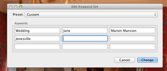
In short, keyword sets are groups of keywords that we can create and keep handy. Instead of adding “wedding” to every image, and then “June” to every image, we can put both keywords in a keyword set and put the set at our fingertips.

When we build keyword sets, we want to keep them fairly “high level.” That means keeping the keywords we use general. We would want to add “wedding” as a keyword, but probably not “flowers” since that won’t apply to every image.

Building a Set

When it comes to keywording, we are going to be doing all of our work in the Library module. This is where we handle the data that’s tacked on to images, and keywords are a perfect example.

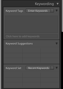
To build a keyword set, first find the keyword panel on the right side of Lightroom’s Library module.

You’ll find the keywording panel on the right side of the Library module.


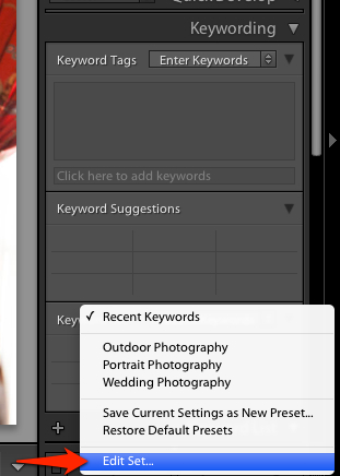
To get started with building your own keyword set, go ahead and click the dropdown arrow next to “Recent Keywords”:

Click the arrows to the right of “Recent Keywords” in this screenshot to get started with building a set.

Next, choose “Edit Set” on the menu that pops up:

Choose edit set on the menu that pops up.

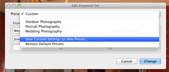
save_as_keyword_preset enter_keywords_for_set

Wrapping Up

Keywords are essential for building the data we attach to images, but take some time to apply. With keyword sets, we alleviate some of the pain and win our time back by keeping the common keywords at our fingertips.

Are you using keyword sets yet? Let me know how you’re applying your keywords.

Filed Under: Lightroom

Lights Out in Lightroom

January 19, 2019 by Andrew Leave a Comment

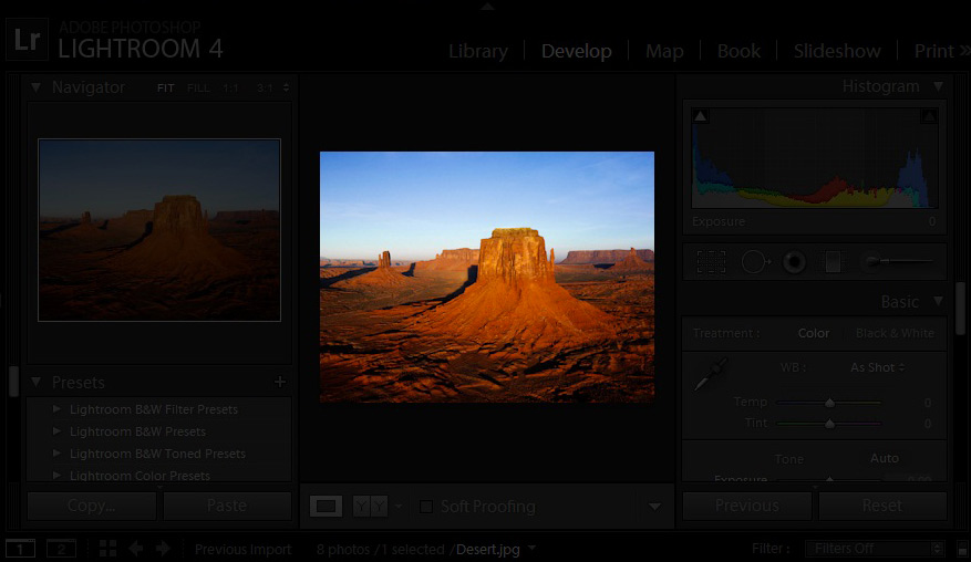
I’m always trying to eliminate distractions. Whether it’s putting my iPhone in airplane mode, unplugging my Internet, or escaping outside, I think eliminating distractions are so key in creative work. Luckily, Lightroom will even let us eliminate distractions within the program using Lights Out mode in Lightroom. Kind of like focus mode or dark mode on steroids.

Lights On

Standard “lights on” view in Lightroom.

Now I’m sure you’re familiar with what Lightroom’s interface typically looks like. Sure it’s great – but the issue at hand is that there is so much going on.

This tip will work for you in any module, and allows you to really hone in on your image. To enable Lights Out mode, go ahead and press “L” on the keyboard.

The lights are now dimmed, and the background is mostly out of view.

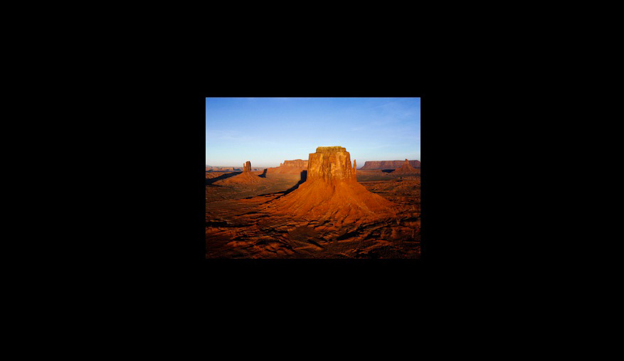
Press “L” one more time and here’s what happens:

The distractions are now completely out of view. All that we need to do is press “L” one more time to return to the default view, turning the lights back on.

Filed Under: Lightroom Tagged With: finished

Sharpening to Perfection

January 12, 2019 by Andrew Leave a Comment

Sharpening is a part of the digital workflow that stumps many photographers. It can be easy to apply, but difficult to perfect the application of sharpening. Luckily, Lightroom has a really powerful and easy to use sharpening panel. Let’s take it on today!

First, we have to clear up what sharpening is and isn’t:

  • What sharpening is: an important tool that enhances detail in our phtoos
  • What sharpening isn’t: a magic tool that saves blurry, out of focus photos

Too many photographers will just crank the sharpening all the way up on a blurry photo, and wind up with a horrible finished product. Don’t do it!

The sharpening are found in Lightroom’s Develop module, in the Detail Panel, which you’ll find on the right side about halfway down:

image

Let’s take a second and talk about what the sliders of the Detail panel do for us:

  • Amount – This is pretty simple; sliding it to the right increases the amount of sharpening that gets applied to our image
  • Radius – This
  • Detail  – asdfsd
  • Masking – asdfhafwe

Let’s dive a little deeper to check out the effects of these sliders:

Amount

When we adjust sharpness, adjusting the amount is always my starting point. The amount scale runs from 0 to 150. It varies from photo to photo, but I’ll typically drag it up to a midlevel number like 50-60 on the slider.

(illustration)

One thing that you’ll notice about the amount slider is that the far right side of the slider is red for a small portion. This is a warning area that cautions you against cranking your sharpening so high. More sharpening causes our images to go ugly and funky, and those high numbers should be used with caution.

Radius

The radius slider describes how “far” we want to sharpen from the edge of a pixel, from 0.5 to 3.0 pixels. This means that the sharpening of the pixel will extend

Typically, I leave this set to the default 1.0 pixel setting, Increasing it will increase our sharpening effects.

Detail

Masking

General Advice

Generally, when I do sharpening, I keep it simple: I’ll increase the amount slider for most of my images to around 25-30 on the amount slider and then leave the rest untouched. Easy enough, right? Images that could stand to have their detail emphasized more might receive a little more adjustment on the other sliders.

Try and work at 100% when working with sharpening. This means using the navigator to zoom in and work on the It’s hard to measure the impact of sharpening when you are zoomed all the way out, and it’s easy to apply too much.

When you use sharpening, the biggest point of advice that I want to offer up is to tread lightly. Many beginners, myself included long ago, have the habit of cranking the sharpening all the way up and creating some nasty looking images. Apply it sparingly and it can bring out the detail of our subject, but it can also be way overdone rather quickly.

With that said, I encourage you to experiment with sharpening to enhance the fine details of your photo!


Filed Under: Lightroom

How to Use Compare View to Select Your Best Image

January 9, 2019 by Andrew Leave a Comment

Do you ever face a tough decision about which image to keep? Sometimes it’s hard to pick that “best” image out of a few.  Lightroom offers a feature that allows us to place two images side-by-side and determine which one we prefer. This is called compare view, and it’s a great way to two-up images and make the choice easier.

Compare view takes place in the Library module. To enter Compare view, press the the letter C on your keyboard, or press the compare view button just below the image workspace.

You can press "C" on your keyboard to enter compare view, or press the button just below the image workspace.

You can press “C” on your keyboard to enter compare view, or press the button just below the image workspace.

After you start up compare view, you may be wondering how to change the two images that are shown in the comparison grid. Lightroom lets us pick any two images to compare, even if they are completely unalike. Entering compare view chooses the image was already selected, plus the image that is directly after it.

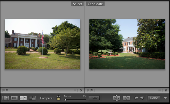
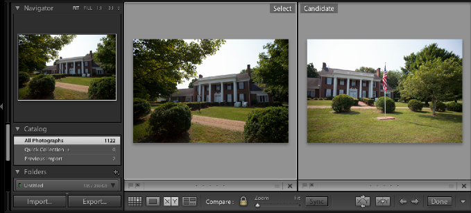
Lightroom’s Compare view always shows two images, which it calls Select and Candidate. The select image is on the left and the candidate image is on the right.

The "select" image is shown on the left while the "candidate" image is shown on the right. Think of the select image as your current favorite, while the candidate is a candidate to replace it.

The “select” image is shown on the left while the “candidate” image is shown on the right. Think of the select image as your current favorite, while the candidate is a candidate to replace it. You choose the select image by clicking on it on the filmstrip, and the keyboard arrows choose other “candidates.”

I always think of the Select image as my favorite, and the Candidate as the image that could possibly replace it.

Clicking on any image on the filmstrip chooses it as the Select image. You can change the Candidate image by using the keyboard arrows, left and right.

In this case, I’m picking my favorite image of the wedding venue. I clicked the first in the series to choose it as my select, and then used the keyboard arrows to continue scrolling through the other selections. Putting them side by side turns this into an easy visual decision.

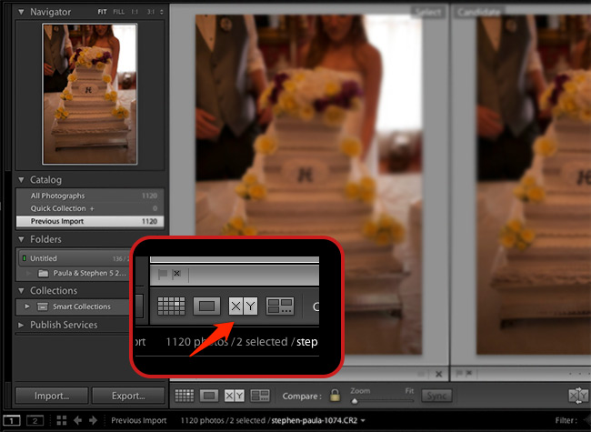
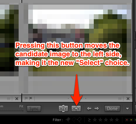
After you find one that you like better, press the button in the screenshot below to name a new “Select” image.

Clicking the button illustrated above names a new "select" image for the left side of the image workspace.

Clicking the button illustrated above names a new “select” image for the left side of the image workspace.

You can repeat this process as many times as you wish, cycling through selections and candidates until you come to a decision.

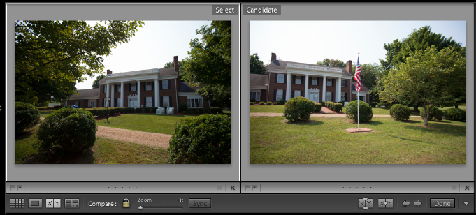
One more tip: when you’re showing two images side by side, you probably want to see the two images as large as possible. To increase the size of the previews, hiding the panel on the left is a great way to do so. Press the arrow to the far left of Lightroom to hide the left side menu. You can always click the arrow to bring that panel back.

Before hiding the panel, the images may be a bit too small to truly judge...

Before hiding the panel, the images may be a bit too small to truly judge your favorite.

After hiding the left panel, the view of the images is much greater.

After hiding the left panel, the view of the images is much greater as they take up the entire area.

Compare view is a nice tool for selecting the best image out of a set. When you’re looking to make those tough decisions between two great images, consider using compare view to do so.

Let’s recap:

  • Compare view is super handy for choosing between two images
  • The “select” image stays on the left, and candidates are shown on the right side of the workspace
  • Clicking on an image puts it on the left side (select), while using the keyboard arrow buttons puts images in candidate view

Are you using compare view to select your best image? Leave a comment if you are using compare view or plan to start.

Filed Under: Lightroom

Browsing Photos in the Library Module

January 2, 2019 by Andrew Leave a Comment

The Library module holds the power to explore and manage our massive image libraries. Today we’re taking a look at how to browse our images with all the power that the module has to offer. I want to go spend today going over five essential parts and methods to navigating images in the Library module.

This walkthrough assumes of course that you already have some images loaded into the catalog. If that’s not the case, you’ll want to check out this article.

1) The Filmstrip

The filmstrip is the horizontal rows of images at the bottom of Lightroom. Clicking any image

2) The Folder Explorer

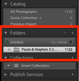
Lightroom allows us to browse images and filter them down by folder, just as our computers do as we explore the folders.

The folder browser lets us explore images in the folders just as our computer's file explorer does.

The folder browser lets us explore images in the folders just as our computer’s file explorer does.

3) The Catalog Panel

&nbsp

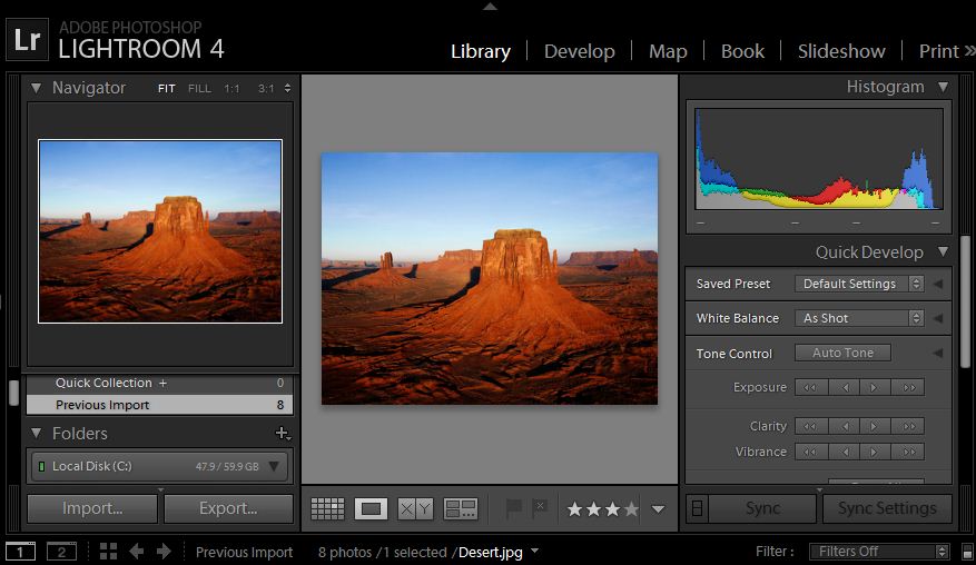
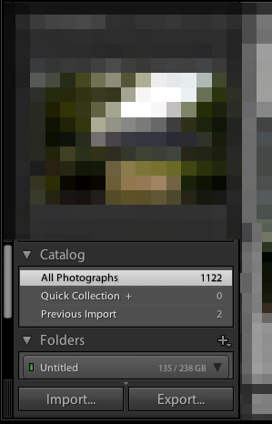
A part of Lightroom’s Library module that is important but doesn’t quite warrant its own post is the Catalog panel. This view allows us to switch between three different image selections: all images in the catalog, images in our current quick collection (which we’ll talk about soon), and the images we added with our last import.

4) The Views

Lightroom has four ways of navigating your images that we talked about recently. These views are grid, loupe, compare, and survey. Check out this post to learn more about these four views and how we can use them.

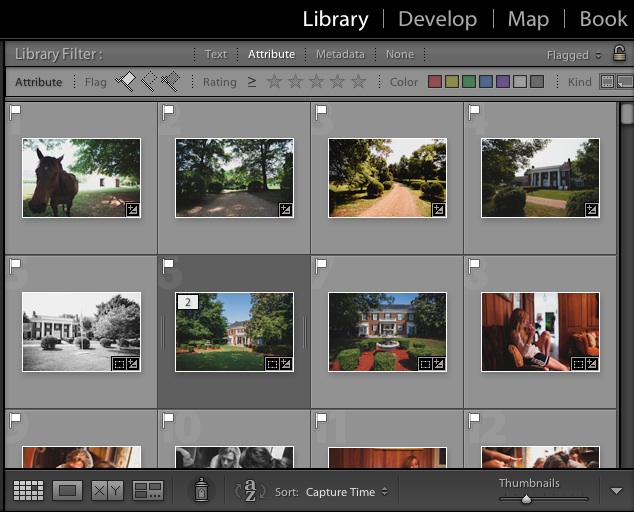
Grid view is one of the many ways of exploring our images in Lightroom's Library module. The four views let us browse the images differently.

Grid view is one of the many ways of exploring our images in Lightroom’s Library module. The four views let us browse the images differently.

5) Filtering


Filed Under: Lightroom

The Power of Lightroom Collections

December 27, 2018 by Andrew Leave a Comment

Collections are yet another way that we can section off certain types of images. Creating a collection is a grouping of images that are lumped together.

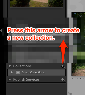
To get started with building collections, make sure that you are working in the Library module. On the left side of the Library module, press the plus button on the panel titled “Collections” to create a new collection, and choose “Create New Collection.”

Press the plus button to the right of "Collections" to start a new image collection in Lightroom.

Press the plus button to the right of “Collections” to start a new image collection in Lightroom. Choose “Create a New Collection.”

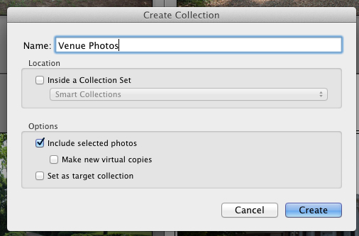
After pressing the button, you’ll see another list of options that pop up. Go ahead and give your collection a name. I’m going to work on putting together venue images from this wedding, so I’ll call it “Venue Photos.”

Go ahead and give your collection a name - I chose Venue Photos in this case. I usually leave all of the other options at default.

Go ahead and give your collection a name – I chose Venue Photos in this case. I usually leave all of the other options at default.

Okay, so now we’ve got a collection! You’ll see that because we left the “Include selected photos” box checked, that two images are already in the collection.

Your collection will pop up on the left side in the Collections pane. You can press the minus button to delete that collection.

Your collection will pop up on the left side in the Collections pane. You can press the minus button to delete that collection.

To add images to the collection, we can simply drag and drop images into that collection.

Do I use collections? Sometimes. I will use them typically when I’m delivering images for a special purpose. I might put together a collection for “Angie’s Corner Florist” or a collection for a particular family member. For me, this use of collections really boosts my workflow and lets those images live in a sandbox separate from all the rest.

On a side note, I want to also say that you may get a little overwhelmed with how to approach a task in Lightroom. If you want to tag your venue photos, you could do it in a ton of ways:

  • With tags, adding “venue” to each venue image
  • With color labels that signify criteria, like blue labels for venue images
  • Using a collection to group venue images in one, easy to find collection

What’s the best way? The good and bad news is that there’s no right way to do things. Design a system that fits what you want to do. I spent so much time searching for the “right” way to do things that I was crippled by planning.

How about you? Are you using collections or will you now that you know about them? Feel free to leave a comment to let me know how you feel.

Filed Under: Lightroom

The 10 Minute Guide to Cropping in Lightroom

December 20, 2018 by Andrew Leave a Comment

Cropping is so important because it can really improve our composition, and we all know about the importance of composition. One of these days, I’ll fill your head with composition ideas, but this is the 10 Minute Guide. 😀 That’s right, in about 10 minutes, we’ll make sure that you can get started with good cropping in Lightroom.

Someday, we’ll take a little closer look at some of the advanced ways to crop photos in Lightroom. But today, we’re taking a look at how to get started with cropping photos in Lightroom in a quick way.

Okay, to get started, let’s make sure that you’re in the Develop module. You can click Develop on the list of modules (upper right hand corner of Lightroom) to enter it, or press D to enter it as well.

Entering the Develop module lets us get started with cropping.

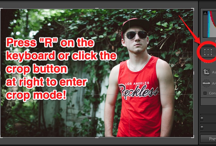
Next, go ahead and pick out the image that you want to work with. To get started with cropping, Press R on the keyboard, or press the crop button (far left) just under the histogram.

Lightroom crop start

Now, we’re ready to get started. You’ll see that a grid has appeared on top of your images, and this is the basis for all cropping.

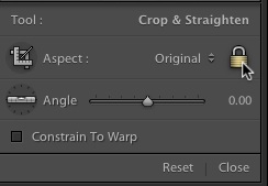
I’ll make a recommendation here: go ahead and press the lock button on the options on the right side. This will keep the dimensions of the photo locked so that we don’t create funky crops. It will basically keep the image the same “shape” as how it comes out of camera. If you want to create

Clicking the padlock locks the aspect ratio.

Okay, now that that’s taken care of, here’s my recommended way of cropping:

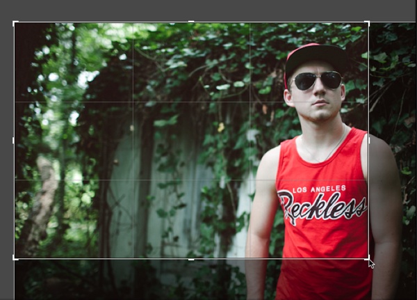
1) Grab a control handle of the photo. These are the thick lines that are at the corners and in the middle at top and bottom. You’ll see your cursor change, and dragging makes the rectangle smaller in area.

Crop Rectangle

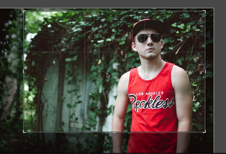
2) After you’ve made a smaller box, just drag the box to the area that you want to keep.

After making a smaller box, I just drag the new smaller area to the “keeper” area”. Anything in darker gray is going to be cropped out.

After you’ve done that, just press R on the keyboard again to leave crop mode and you’ll find your new crop!

Just two steps: resize a smaller area, and drag it to the part we want to keep

Another method is to just draw the rectangle over the area of the photo you want to crop to by clicking and dragging the box. If you want to “start from scratch” with the crop, that’s the best way of doing it.

So there you have it – you’ve got a really quick and easy crop method! I can do most crops in under 10 seconds after mastering the tool.

Did I explain this clearly? This is fairly easy to do, but a little tough to get started with. If you need more help, check in with a comment and I can explain more. 😀

Filed Under: Lightroom Tagged With: finished

Should I buy Adobe Lightroom?

December 16, 2018 by Andrew Leave a Comment

This post is aimed at users who have never used Adobe Photoshop Lightroom. If you’re wondering if you should upgrade from Lightroom 3, check out this post.

If you’ve taken notice of this site’s name, you can probably get a good idea of what my answer to the question is. But my path to using Lightroom might surprise you.

Given the name of this site, you probably already know my answer.

When I first used Adobe Lightroom, I hated it. I had buyer’s remorse about buying it. I hated the complexity of it, as well as

The problem wasn’t the program. The problem was how I used it.

I’m reminded of a quote a favorite teacher shared with me about how best to attack big problems (or in this case, big programs):

How do you eat an elephant? One bite at a time. 

Attempting to jump into Lightroom and bite it off all at once is not going to end well. Instead, approach Lightroom seeking to solve your problems. As I’ve said before, each of the modules is really a solution.

If you’re serious about taming your image collection, learning Lightroom is the best investment of your time. In my opinion, there are no other applications that come close to rivaling the power of Adobe’s photo management software.

Filed Under: Lightroom Tagged With: finished

Vintage Film Effect in Lightroom 4 Using Curves

December 16, 2018 by Andrew Leave a Comment

One of the most popular editing effects right now is pushing digital images to look more like film photos. Digital has taken over the world, but film has a “look” that’s just hard to match. I would certainly advocate going out and shooting some rolls of film, but if that’s not a possibility, we can use Lightroom to apply a vintage film effect using the tone curve.

The tone curve scares some users away because it’s not like anything that they’ve ever seen before. It’s a graphical representation of the photo, and it’s not necessarily logical. Let’s take a look at how to use it.

  • First of all, go ahead and pick an image to work with and enter the Develop module.
  • Now, feel free to apply any other tweaks that you need to – exposure, clarity, temperature, etc.
  • Okay, scroll down the right panel in the Develop module and you’ll come to the Tone Curve. This has the secret sauce for what we want to do.

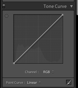
Here’s what my tone curve looks like to begin with:

By default, this is how the tone curve will appear.

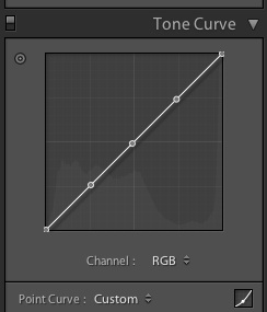
Looking pretty flat right now right? What we want to do is add some control points that we can shape this curve with. To add these points, all we have to do is click where we want the points. I added three points; this is how I positioned my points:

I added 3 points for this effect.

Okay, now we’re ready to have fun. Let’s talk a little theory here. Right now, we’re starting with a default tone curve. The point at the lower left hand corner represents the black areas of the photo. The point in the upper right hand corner represents the “whites” of the photo. As we move these points, we’re pushing the blacks to grey, and likewise for the whites. You’ll see what I mean here in a moment.

So here’s my starting image:

The starting image.

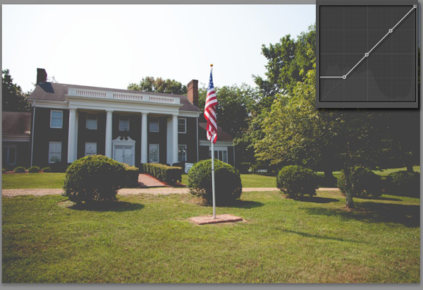
Now, to start playing with the image, I’m going to grab the lower left hand corner point, and start dragging it up. I pull it up until it flattens out.

See what happened here? In the upper right corner, you can see how my curves look at this point. Compare this to the earlier image, and you can see that the black areas of the photo are pushed to greys. That’s what playing with the tone curve does!

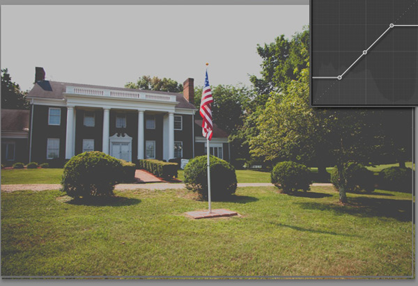
Now, let’s play with the upper right hand corner. Here’s what we get:

Now, we’ve pushed the white area – represented by the upper right hand point, down to the greys as well by dragging it downward.

I really like the effect that this provides. It kind of “mutes” the photo and reduces the contrast, and reminds of the film photos that I grew up around.

Of course this can be done with a free lightroom preset as well.

Filed Under: Image Editing Tagged With: finished

« Previous Page
Next Page »

Search

Latest Posts

  • Merging Catalogs in Lightroom
  • Troubleshooting Lightroom: 5 Quick Fixes
  • Quick Tip: How did I edit that photo?

All Pages

  • About
  • Contact
  • Get Help
  • Home
  • Lightroom Dictionary
  • Sign up For Updates

Copyright © 2023 · eleven40 Pro Theme on Genesis Framework · WordPress · Log in